2. First example: a sine
We will go through a simple example fit to introduce how the module works. First, import the modules:
import lsqfitgp as lgp
import numpy as np
import gvar
I suppose you know about numpy, but you may not know about gvar.
It is a module for automatic linear correlation tracking. We will se how to use
it in the example, if you want to know more it has a good documentation.
Now we generate some fake data. Let’s make a sine:[1]
x = np.linspace(-5, 5, 11) # 11 numbers uniformly spaced from -5 to 5
y = np.sin(x)
We won’t add errors to the data for now. What we are going to do in the next steps is pretending we don’t know the data comes from a sine, and letting the fit guess a function that passes through the data.
The first step in using a Gaussian process is choosing a kernel function. Say \(f\) is the unknown function we want to model. The kernel function \(k(x, x')\) specifies the covariance we expect a priori between \(f(x)\) and \(f(x')\):
This means that the a priori variance of \(f(x)\) is \(\operatorname{Var}[f(x)] = k(x, x)\), and the a priori correlation between \(f(x)\) and \(f(x')\) is
Again, in other words: \(\sqrt{k(x, x)}\) expresses how much you are uncertain on the function value at \(x\) before seeing the data, and \(k(x, x')\) expresses how much you think the value at point \(x\) is linked with the value at point \(x'\).
lsqfitgp allows you to specify arbitrary functions as kernels; however,
not all functions are valid kernels, so it is convenient to use one of the
already available ones from the module. We will use a quite common kernel, the
exponential quadratic:
which is available as ExpQuad:
kernel = lgp.ExpQuad()
Note the parentheses: ExpQuad is a class, and we create an instance by
calling it.
Now we build a GP object, providing as argument the kernel we want to
use, and tell it we want to evaluate the process on the array of points x
we created before:
gproc = lgp.GP(kernel).addx(x, 'foo')
So, we add points using the addx() method of GP objects. It
won’t be very useful to only ask for the process values on the data—we
already know the answer there—so we add another array of points, more finely
spaced, and more extended:
xpred = np.linspace(-10, 10, 200)
gproc = gproc.addx(xpred, 'bar')
When adding x and xpred, we also provided two strings to
addx(), 'foo' and 'bar'. These have no special meaning, they
are just labels the GP object uses to distinguish the various arrays
you add to it. You can think of them as variable names.
When calling addx the second time, we did gproc = gproc.addx(...), instead
of just gproc.addx(...). This is necessary because GP object are
immutable: each operation returns a new GP object, leaving the original as it
is. This may cause some easy to fix coding errors, but it prevents messier ones.
In Python this paradigm is employed, e.g., by strings.
Now, we ask gproc to compute the a posteriori function values on
xpred by using the known values on x:
ypred = gproc.predfromdata({'foo': y}, 'bar')
So predfromdata() takes two arguments: the first is a Python
dictionary with labels as keys and arrays of function values as values, the
second is the label of the points on which we want the estimate.
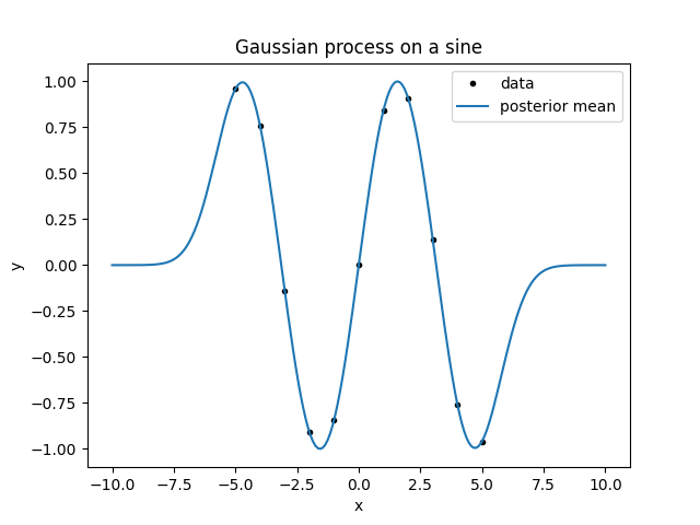
Now we make a plot of everything:
from matplotlib import pyplot as plt

fig, ax = plt.subplots(num='lsqfitgp example')

ax.set_title('Gaussian process on a sine')
ax.set_xlabel('x')
ax.set_ylabel('y')

ax.plot(x, y, marker='.', linestyle='', color='black', label='data')

ypred_mean = gvar.mean(ypred)
ax.plot(xpred, ypred_mean, label='posterior mean')

ax.legend()

fig.savefig('sine1.png')
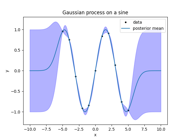
To plot ypred, we did ypred_mean = gvar.mean(ypred). This is because the
output of predfromdata() is not an array of numbers, but an array of
gvar.GVar objects. GVar variables represent Gaussian
distributions; gvar.mean() extracts the mean of the distribution. Let’s
make an error band for the fit by computing the standard deviations with
gvar.sdev():
ypred_sdev = gvar.sdev(ypred)
bottom = ypred_mean - ypred_sdev
top = ypred_mean + ypred_sdev
ax.fill_between(xpred, bottom, top, alpha=0.3, color='blue')

fig.savefig('sine2.png')
Look at the result. First, consider the line giving the mean. Between the data
points, it goes smoothly from one point to the next. It reasonably approximates
a sine. However, outside the region with the data it goes to zero. This is about
a thing I forgot to mention when introducing kernels: apart from the variance
and correlations, a Gaussian process also has an a priori mean. lsqfitgp
always assumes that the a priori mean is zero, so, going far from the data, the
a posteriori mean should go to zero too.
It would be easy to provide an arbitrary prior mean by first subtracting it from the data, and then adding it back to the result. However, I encourage the reader to avoid using prior means at all while learning Gaussian processes. You should always think about the links and correlations between the points and the general properties of the function instead of focusing on what value or specific functional form you expect, and let the data choose the values and shape.
Now look at the band. It is a band of \(\pm1\sigma\) around the posterior mean (\(\sigma\) stands conventionally for the standard deviation). For the Gaussian distribution, this interval has a probability of 68 %. A \(\pm2\sigma\) interval would have a probability of 95 %, so this means that the fit expects the function to stay most of the time within a band twice as large as that plotted, and 2/3 of the time inside the one plotted. So, the summary of the figure is this: close to the points, the function is probably a sine; as soon as we move out from the datapoints, the fit gives up and just returns the prior.
Instead of trying to interpret what functions the fit result is representing, we
can sample some plausible functions from the posterior distribution. gvar
has a function for doing that, gvar.raniter():
for ypred_sample in gvar.raniter(ypred, 4):
    ax.plot(xpred, ypred_sample, color='red', alpha=0.3)

fig.savefig('sine3.png')
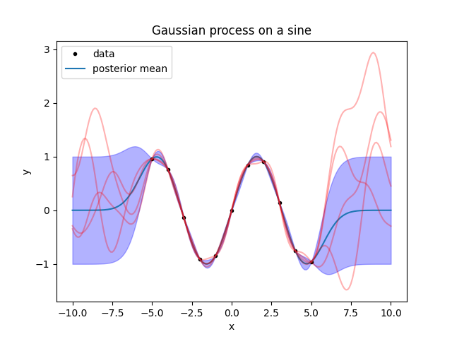
What do we learn from this? First, the sampled functions are a bit uglier than the mean line, even between the datapoints. To have a clear idea of the result, you should always plot some samples instead of looking at the mean.
Second, outside the datapoints the sampled functions oscillate with peaks that are a bit too narrow compared to the peaks of the sine. This is invisible by looking at the error band, so again: to have a clear idea of the result, plot some samples instead of looking at the error band.
Now, to try to get a smooth fit, we want to increase the “wavelength” of the
kernel to match that of the sine. To do that, we just need to rescale the
input points prior to feeding them to the kernel. We could do that by hand by
multiplying x and xpred by something, but all Kernel objects
provide a convenient parameter to do that automatically, scale. So
let’s do everything again, rescaling by a factor of 3:
gp = (lgp
    .GP(lgp.ExpQuad(scale=3))
    .addx(x, 'foo')
    .addx(xpred, 'bar')
)
ypred = gp.predfromdata({'foo': y}, 'bar')

ax.cla() # clear the plot

ax.plot(x, y, '.k')
for sample in gvar.raniter(ypred, 5):
    ax.plot(xpred, sample, 'r', alpha=0.3)

fig.savefig('sine4.png')
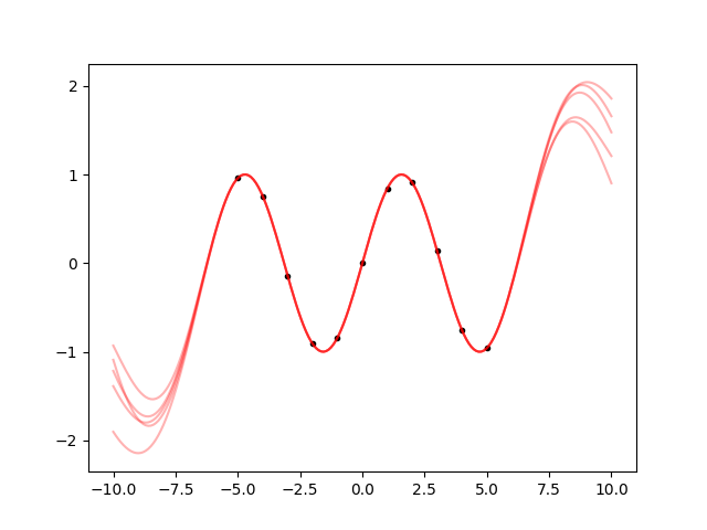
This is a bit more similar to the sine. Between the datapoints, the samples all follow the same path, and they continue to oscillate in a reasonable way also outside from the datapoints. But what further away? Let’s make a plot from -20 to 20:
xpred_long = np.linspace(-20, 20, 200)
gp = gp.addx(xpred_long, 'baz')

ypred = gp.predfromdata({'foo': y}, 'baz')

ax.cla()

ax.plot(x, y, '.k')
for sample in gvar.raniter(ypred, 5):
    ax.plot(xpred_long, sample, 'r', alpha=0.3)

fig.savefig('sine5.png')
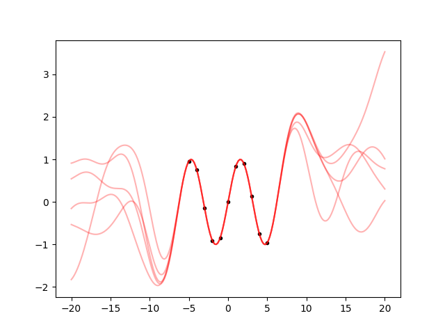
So, after a an oscillation, it still goes back to the prior, as it should. It
just goes on 3 times as much as before because we set scale=3.
Finally, let’s see how to add errors to the data. First, we generate some Gaussian distributed errors with standard deviation 0.2:
rng = np.random.default_rng([2023, 8, 23, 16, 28])
yerr = 0.2 * rng.standard_normal(len(y))
y += yerr
Then, we build an array of GVar variables from y:
gy = gvar.gvar(y, 0.2 * np.ones(len(y)))
Now gy represents an array of independent Gaussian distributions with mean
y and standard deviation 0.2. We then repeat everything as before, but
using gy instead of y:
ypred = gp.predfromdata({'foo': gy}, 'baz')

ax.cla()

ax.errorbar(x, gvar.mean(gy), yerr=gvar.sdev(gy), fmt='.k', capsize=2)
for sample in gvar.raniter(ypred, 5):
    ax.plot(xpred_long, sample, 'r', alpha=0.3)

fig.savefig('sine6.png')
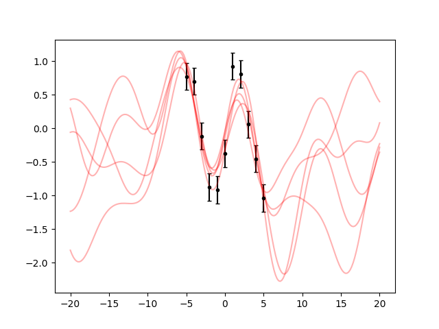
The behaviour makes sense: the samples are not forced any more to pass strictly on the datapoints.
You should now know all the basics. You can experiment using other kernels, the available ones are listed in Predefined kernels.
Footnotes